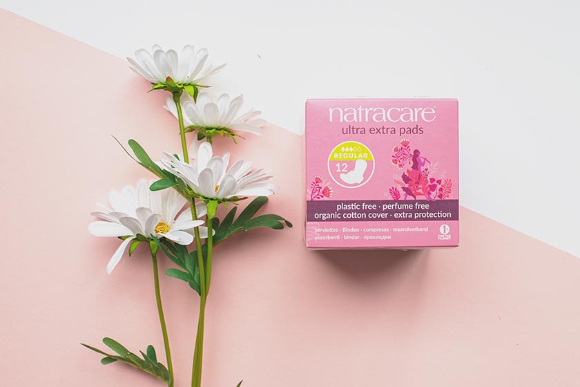
In case you missed it, our period products range has got a whole new look! We asked Bristol-based artist Zoë Power to redesign our packaging to better reflect our brand and audience, incorporating our sustainability and intersectional feminist ethics. If you’ve seen the packaging in stores or on our Instagram, you might have picked up on a few themes already. Here’s a little bit more information about what the elements of the packaging mean to us.
Key messaging of the packaging
We wanted Zoë to help us to show three strong values we live by:
- Our care for the planet and its creatures
- The empowerment of all people with periods
- Our campaigning roots and activism
These key messages speak to everything we stand for at Natracare and are the foundation to how we began back in 1989, thanks to our founder, Susie.
The three key design elements we chose to communicate these messages are: plant imagery, people, and the interaction between them. Let’s delve a little deeper.
The plants
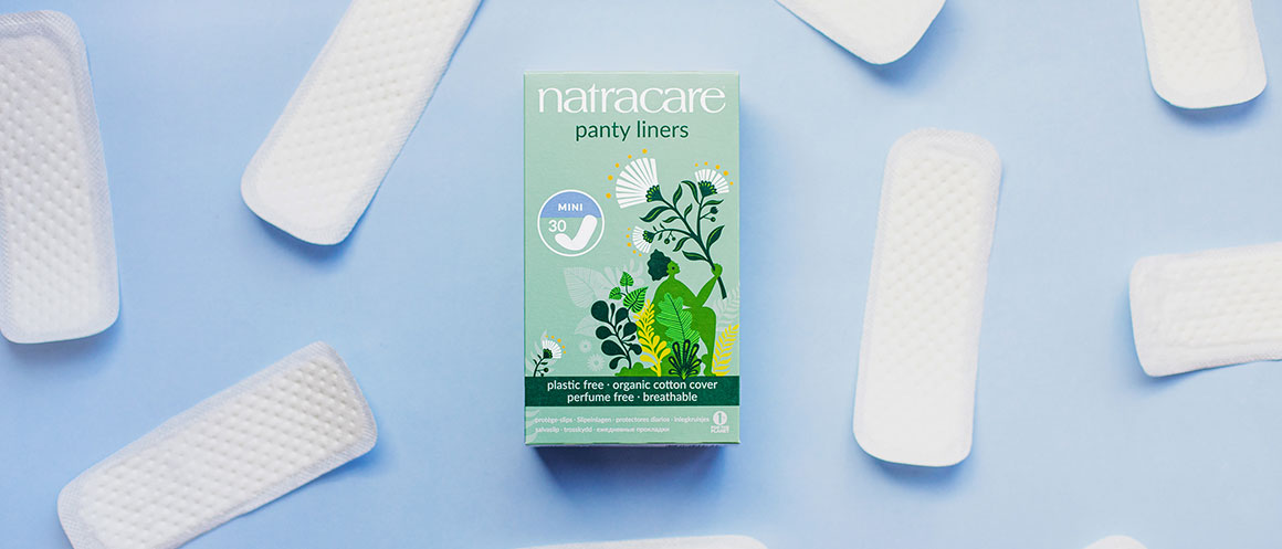
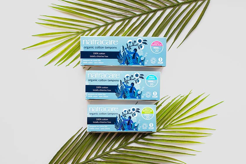
Looking after the planet and nature is at the core of everything Natracare does. Our period products are made from natural materials – plants. That’s why it’s so important to feature plants and nature on our packs. When you see Natracare, we want you to think of the planet and how our products are designed with protecting nature in mind.
Each different foliage motif speaks to the importance of biodiversity, and the plants that look more oceanic are a nod to the protection of the world’s oceans. We work to organic principles, which encourages sustainable farming practices, biodiversity, and renewable materials.
The people
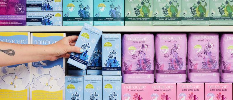
Natracare has a global user base and is sold in over 80 countries. How do we represent each person who uses our products? With variety.
People from all backgrounds, with different experiences, bodies, and identities have periods and use Natracare. To help our diverse audience (you!) feel seen, represented, and empowered, the people on each pack are different to each other. Zoë embodied figures with varied hair, body shapes, and colours in a beautifully abstract form.
Action and activity were also essential for how to represent the figures. We’re an active, campaigning brand, and our customers are living, breathing, moving, and campaigning people too. That’s why the people on the packs look like they’re in motion, walking somewhere, lifting something, or pushing themselves up. They aren’t passive, pretty figures – they’re strong and active people, just like our audience.
The plants and the people
Now with both plants and people on the packaging, we wanted to show them in partnership! People lifting up the plants, the plants surrounding and protecting the people, and the two standing together in protest to fight the threats against them. The relationship between people and the planet is one we seek to nurture, as we know you do too.
The interactions between the plants and people are designed to show the campaigning roots of Natracare. Susie Hewson started Natracare as a campaign, and to this day we continue our fight for better options – for people and the planet. Some motifs on the designs show people holding the plants up like they’re placards at a protest. We need to campaign for the future of our planet together and work with nature. That’s what we want to communicate.
get your hands on
the new designs
Find your nearest store
Other elements to look out for
There are also some nice other features on our new packaging like:
- The 1% for the Planet logo that tells you we donate 1% of our yearly turnover to environmental organisations.
- The vegan and organic certifications that help you to better understand the materials we use and where they come from.
- The complete list of packaging and product ingredients that tells you exactly what you’re buying and using.
We know that when you’re due on your period and experiencing PMS you might not be worried about what the packaging is trying to communicate with you. But we hope they brighten your bathroom and mood a little during your period and remind you why you continue to choose Natracare. We want to be bold and caring, and our packaging is just one way for us to share and show that with you.
Take a look at our full range of products here.